Yorokobu Branding
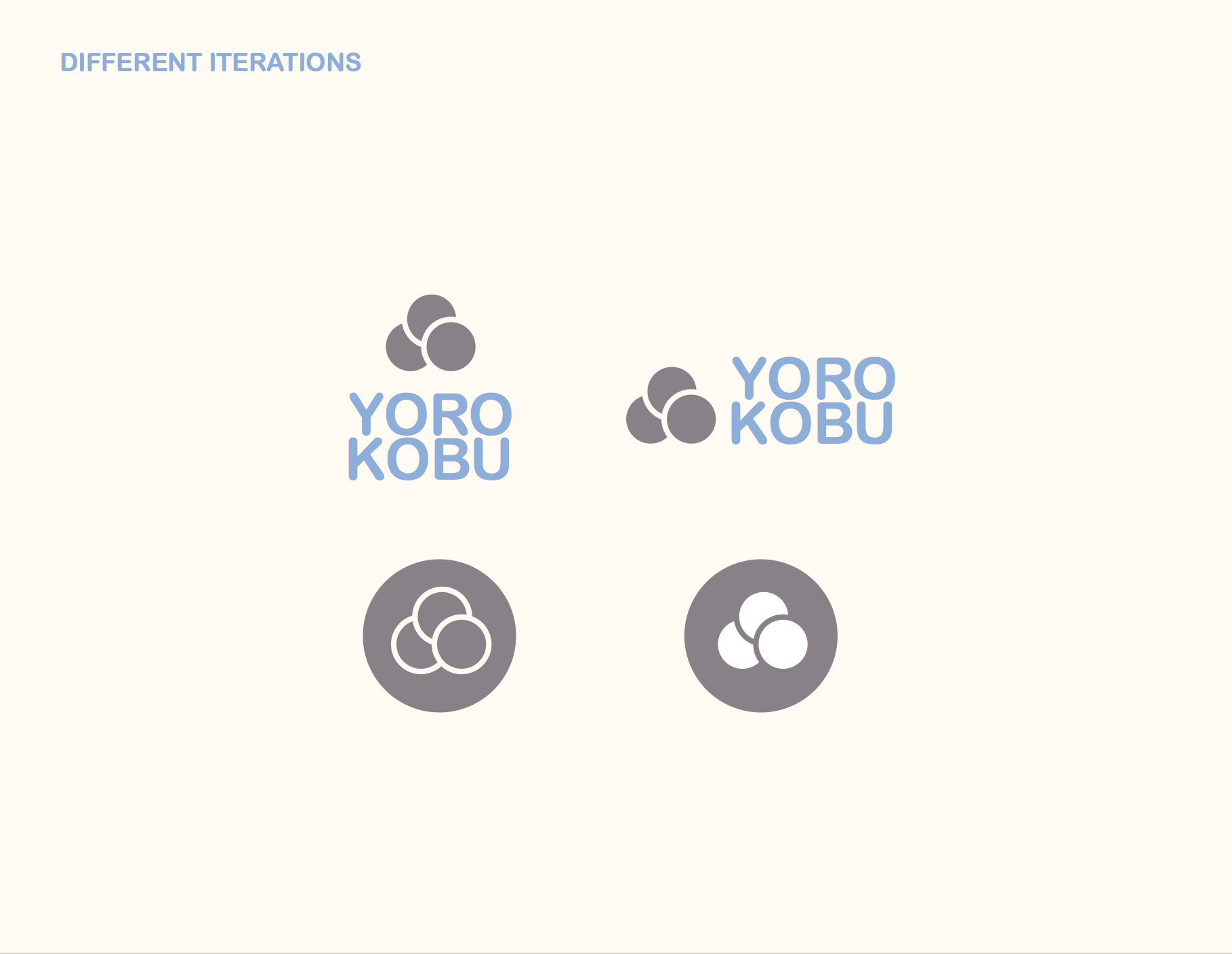
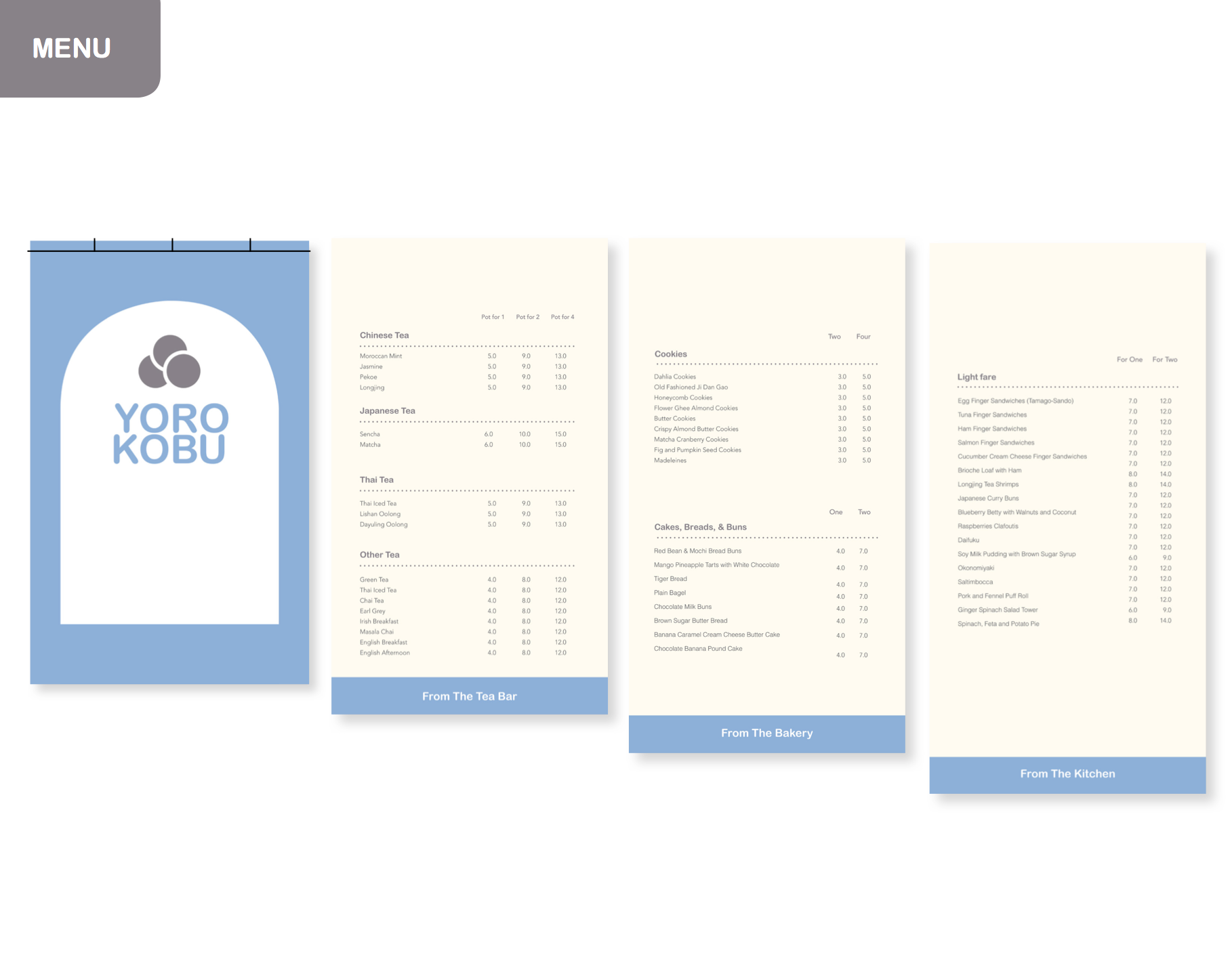
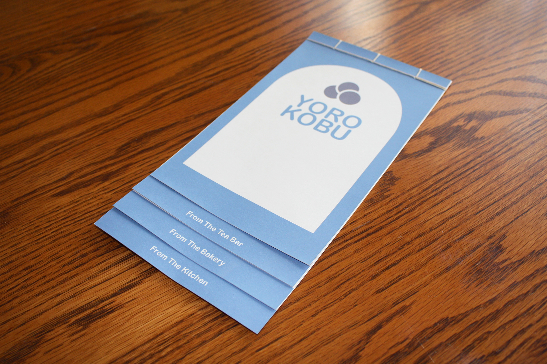
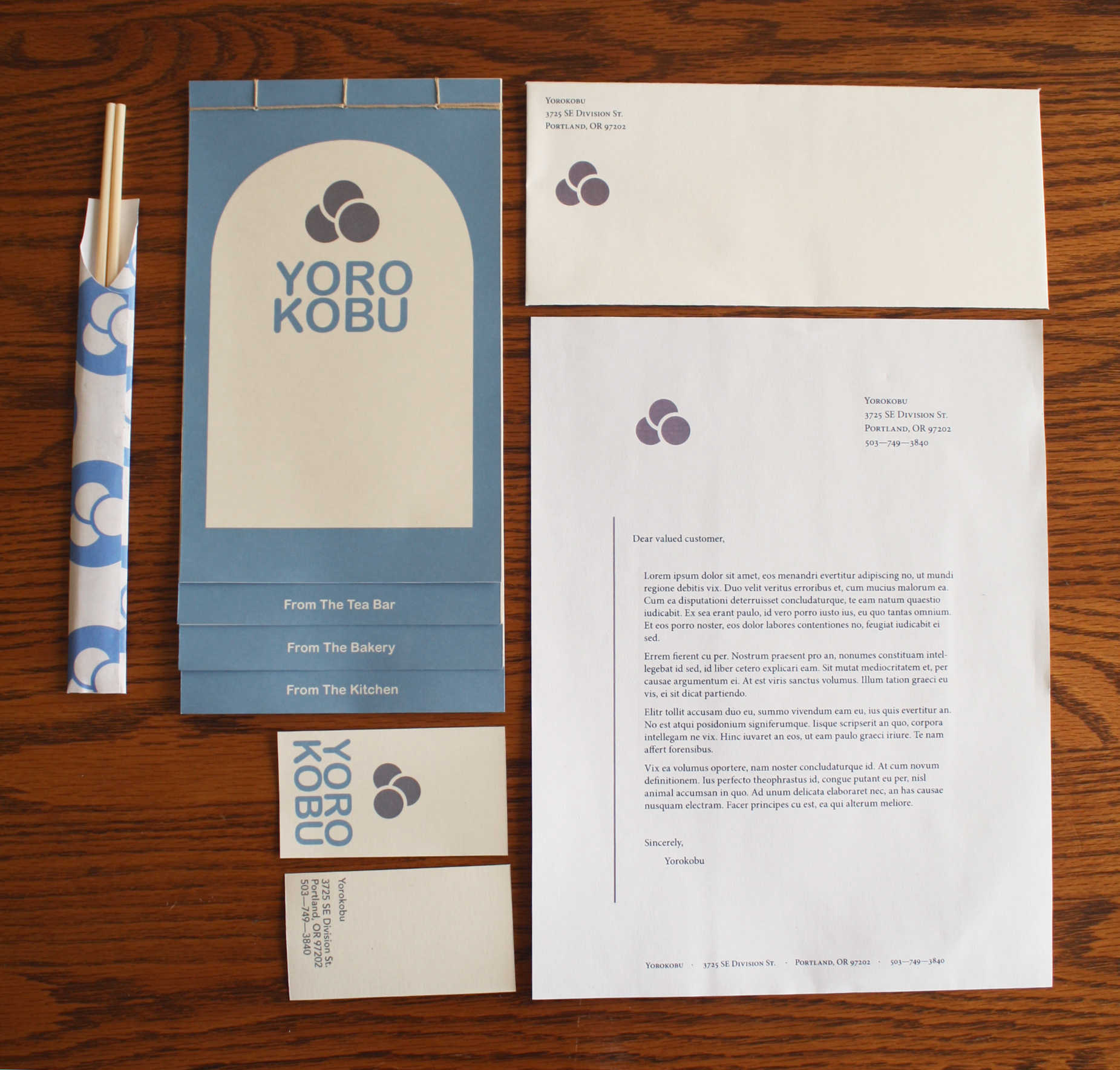
Branding Identity for Yorokobu, an Asian style tea house & bakery. Yorokobu translates to mean "to be happy." The brand features a tiered flip menu with a Japanese binding, business cards, stationary, and chopstick wrap. The logo reflects the three O's in the name.
You may also like
Learn How To Crochet Magazine Article
2014
2019 Cutest Pets Calendar
2019
RiverKeeper SWEEP Poster Design
2014
Exposure App
2014
DOG BADGES (Short Snout Edition)
2017
LOGO COLLECTION 01
2017
Differently Abled Animals
2015
MHHS Summer Camp T-Shirts
2022
MHHS Paws in the Park Logos
2018
Market 32 Harvest Day Material
2015